Monday, January 27, 2014

When Things Are Complex Keep It Simple


Over the past year we have been following the markets together, and I will say I have been pleased with the results. While last year was spent getting everyone up to speed on managing their money and learning common market theory, we have built a nice foundation and it is time to evolve our process a little bit. I have been thinking about what I would want to change with our Blog Portfolio strategy and our watch list stocks for the last few weeks. What I have concluded is that I want to adjust some of what we follow and invest in, while also having a few concise rules we will need to trade by going forward.

Basically I want to continue to simplify our process while also continuing to post strong returns. Currently we are managing positions on our Top 10 Watch list and the 9 S&P sector ETFs.

First I have decided that this is a little too many holdings to currently invest in within our one Blog account. It simply stretches my funds too thin to adequately fund each position. So I am going to eliminate from the holdings in our portfolio the 9 sector funds (I will still track their progress and post monthly on their status) and I also am going to adjust the holdings of our 10 watch list stocks to fit one stock per sector group. Right now we have 10 stocks that we track:

Financials (WFC)
Consumer Discretionary  (HD and F)
Technology (AAPL)
Industrial (CMI)
Materials (PPG)
Energy (ENB and PBW)
Consumer Staple (HAIN)
Tech/industrial (DDD)

The thing I notice is that we don't have each sector equally represented. We do not track a Utility or a Health Care holding and we have a couple sectors where we track more than one position. My plan in the coming week will be to choose a Utility stock (I'm thinking AEP will be the choice), a Health Care stock, and I will need to consolidate our Energy exposure and Consumer Discretionary. I still only want to follow 10-12 positions for this account and intend on having one position as TLT, which is the long term treasury bond. We will want/need that exposure as a market hedge when the trend inevitably turns lower for stocks.

I didn't want to completely change our watch list as many have grown familiar with each holding and likely hold the positions in their accounts. However with the past week's market action a natural rebalance could be in the cards in the near future anyway. I think now will be a good time to get that ball rolling to create an even more balanced and targeted watch list.

--The second thing I want to work on is creating a VERY simple and clear method to follow for exactly what, when and how much to buy of each and any asset position; what I'm hoping to create is an effective plan that ANYONE can follow with a simple glance at any asset's price chart. The entry/exit methods we have used over the previous year will be more or less the same criteria going forward but we will make a slight adjustment to exactly how it's executed. Currently we track the 20 WMA, Relative Strength vs the SP500, and key support/resistance levels. There is no need to reinvent the wheel, but a few minor tweaks will allow us to maneuver around a position without an "all in, all out" mentality. This will help avoid being shaken out of an entire position right as it's about to turn and resume higher.

Here is what I'm proposing:

-each signal will represent 1/3 of a total position size for each holding.

-since we will likely track 12 stocks, divide our account size by 12 to know how much will be allocated to each holding. We then want to know what 1/3 of each position allocation is, that will be how much capital we deploy when a signal is triggered.
-When a signal triggers we will add 1/3 of a total position size, when a signal fails we will exit 1/3.
This allows us to manage a position based on several criteria of strength and therefore only the absolute strongest setups will warrant a full position size.
-Positions will be ranked 0/3, 1/3, 2/3, 3/3 depending on how many active signals are in play. We will then hold that amount of each total position.

3 Signal Plan
1. Price is above a RISING 20 WMA (1/3 position)

2. Relative Strength Breakout (1/3 position)

3. Price Pattern Breakout (1/3 position)

Each of these signals represent levels of strength and each is a proven winning strategy vs "Buy and Hold" investing. They do of course require attention and management however and that is what most people are unwilling to do. If you are willing to put the time in and enjoy the "game", you will come out ahead of the rest. 

The primary basis of the strategy alteration is to scale in and out of positions rather an an all in, all out method; you can also call this "trading around a core position". Basically we watch our 12 stocks, when a stock triggers one of our signals we make a buy. If that stock then moves ahead in the coming weeks and triggers another signal we buy more. What this creates is a situation where you are adding to winning positions as they grow stronger. Some people like to wait until thier stocks come down in price and they then add to it. But what this creates is a portfolio full of large losing positions and small winning positions. Think about it, if you only buy more of a stock when it is lower than your initial purchase, only your weakest holdings are large portions of your portfolio. Your winners are ignored and allowed to run on making a little bit, but nothing substantial. Meanwhile you are pouring money into losing holdings. You need to start thinking about portfolio management from the other perspective. 

You want to buy more of your best positions as they continue to strengthen. That doesn't mean buying every new high the stock makes; it means as your strong holdings move forward and higher in price, they will set up new positive risk/reward scenarios and you increase your size as those new setups emerge.  

At the same time if these signals begin to fail we reduce our exposure to the stock. As the stock weakens we sell off our positions as each signal fails 1/3 at a time. This again reiterates the previous theory, buy more of your best and get rid of the weak. 

Lets take a look at each signal individually, so everyone has a very clear idea of what our buy signals look like:

Price Above Rising 20 WMA
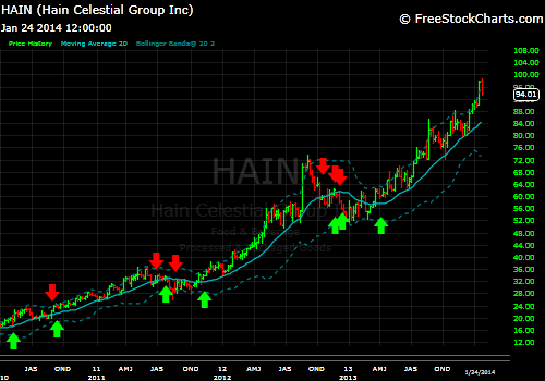
  
 We will look at prospect HAIN for how the Rising 20 WMA signal works. 
-Buy(green arrows) 1/3 total position when price closes the week above the 20 WMA while it is rising. We can reduce the "false signal" by waiting for price to make a new multi-week high confirmation.
-Sell(red arrows) 1/3 position when price closes the week BELOW the 20 WMA rising or falling. To reduce false signals we will use price support just below the moving average that will signify a real breakdown below the 20 WMA.

What this does is that it gets us into the stock when the intermediate trend is turning higher and gaining momentum, and it gets us out when any serious trouble presents itself. Trust me on this, you will never suffer through a bear market above the 20 WMA. This simple filter reduces your exposed risk significantly while positioning you for all potential upside moves. 

Occasionally you will get a false signal and be what is called "whip-sawed". A Whip-saw is a situation where you get shaken out of a good position only for the stock to reverse and go right back in the prior direction. So it will create some frustrating moments, but do know your amount of risk vs potential reward is strongly in your favor. If price goes above the 20 WMA but the average is declining week to week, that is a false signal and is to be ignored. We only buy when the stock is trading above the RISING average and making new multi-week highs, signifying a resumption of trend. 

*Note we do have an additional criteria for potential profit taking, if you are into that kind of thing. 
-When a stock moves a certain distance above its 20 WMA, it is deemed heavily overbought and generally leads to a corrective period. Typically I have found that for most large cap stocks that distance is about 12-13% above the 20 average. This depends on a few factors but in general it is prudent to take gains at these extreme levels. 
-Once a profit is taken, it is necessary to reenter the prior holding once price returns in line with the averages. 

Relative Strength Breakouts vs. SP500

Here is a rough example of how you would have used RS Breakouts to trade AAPL's stock over the past 4 years.
-Buy 1/3 total position when a downtrending RS trend is broken on a closing basis.
-Sell 1/3 position when RS uptrend or horizontal support fails to hold. 

Yes in hindsight its seems ridiculously easy, and it is. But in fairness and full disclosure I have traded this method in AAPL successfully beginning late 2012. I actually bought that surge right into the massive top when RS broke out of its 1-year sideways trend. I was stopped out rather quickly and for a small loss, but in hindsight this was my favorite trade I have ever made. And that trade was a sell after a small loss (I lost about 1.6%). AAPL was the coolest stock ever in late 2012, "you couldn't lose money by investing in it" was the thinking. This signal doesn't care about feelings and sentiment, it cares about rotating funds from strong to weak and vice versa. It signaled a sell and it was right. Everyone else who "thought" everything was fine lost 30% of their investment.

This position has since evolved into a fantastic winner for our Portfolio in the back half of last year and is still setup for continued positive risk/reward at this time. 

Price Patterns

 The final trading signal worth our while is a Price Pattern breakout. 
-Buy 1/3 position once an established chart formation is setup and a breakout occurs. 
-Sell 1/3 once price objective is acquired or pattern fails through protective stop. 
Price targets are derived from measuring the height of the pattern and adding that amount to the breakout area.  

Price Patterns are the most subjective of all the market signals, but they do have solid track records historically speaking. Being able to identify patterns in price action is a skill that is only gained from study of the markets. While as trivial as a price formations seem,  patterns signal sentiment and trader's emotions. Humans tend to act a certain way in a repeatable manner when it comes to dealing with the emotions associated with fear and greed. These little behavioral patterns tend to manifest themselves in the price action. Its seems like witchcraft, and maybe it is, but it continues to work for me. 

---
That's it. That's how we are going to attack all entries and exits going forward. We will manage our open positions based on these signals and will track all progress to see how each signal performed over the course of the year. My study of the markets has led me to these conclusions: 
-you must have a plan
-your plan must be simple and unemotional
-your plan must skew risk/reward in your favor vs random events
-you must execute your plan...
-you must execute your plan!(this is really the hardest part of individual investing)

If you have a plan that puts your money in when the odds are in your favor more often than not, you are going to come out ahead. Your plan must be able to eliminate catastrophic loss to your accounts, it must also be able to minimize what losses you will face, and it must position you correctly when the market rallies strongly. If your plan can do most of that then you will come out better than most in the long run. I think we are very close to being at that level.

This week I will do my best to highlight each of our holdings (after i adjust our list to accommodate all groups) for the "signal score". Each holding will have a 0-3 out of 3 ranking. That will be based on how many active signals are currently in play. I will be using this coming week to prepare that list for you and position our Portfolio appropriately based on those signals.

Sunday, January 26, 2014

Weekend Update: Profit Taking Gathers Momentum

Our post last week highlighted some warning signals for the market...This week those concerns were in part put into motion. We saw heavy profit taking across the board and many setups are in jeopardy. It is typical in bull markets to see a slow grind higher followed by swift and violent counter trend moves. These moves usually stem from some sort of negative news event and itchy trades fall over one another heading for the exits. This sort of action results in a "whoosh" (a highly technical term) type sell-off, but then ends relatively quickly and the rally continues. We have seen this often over the past couple years.

Its hard to see on this chart but if you zoom in and look at these bars you will notice how most of the large sell-off days we have seen for the last couple years, end or are no more than 2 days from a bottom, before the market V-shape bounces to new highs. Will this happen again this time? Is everyone expecting it to? We will have to see, but also you can see that these kind of moves are fairly typical in bull market rallies to new highs. The buyers continue to come in on any weakness and the trend resumes. The question once again is, will the market snap back another time?

This would be a MAJOR change of character for the market should we see multi-day/week failure without a sharp recovery rally. It will give us a very clear picture of how dip buyers are currently feeling. If the buyers dry up for the sake of taking profits, that would not be a good sign for stocks near term and a visit to the long term uptrend support would be the likely result.

That being said, here is the weekly chart to put things into longer term perspective.

When you take a step back, things aren't that scary at all. If the market continues lower and breaks the 20 WMA, it will be important to see that it bounces back very quickly. Looking back at the last couple years, price has not stayed below the 20 WMA for long, and never set a lower low after the initial bounce back. Shorter term things are not perfect, but longer term no real damage has been done to the SP500.

We did lose 3 of our 8 sector holdings this week with XLY, XLE, and XLP failing to hold their key support levels; I will be a seller of those at Monday's open. However I will also be closing my other sector holdings completely. I have continued to do more year-end review for the blog and have decided to change a few things this coming year and beyond. I will discuss those changes in a post to follow soon...hopefully by Monday at the latest. There are no major changes coming in terms of what we do, but I have reviewed our trades from this year and Portfolio performance, and I feel we could do even better in the future should we adjust the ways we manage open positions. These adjustments will be meant to continue to reduce risk, while improving overall returns simultaneously. That is my hope at least. Look for the post to follow...

--One last thing to note heading into next week is that TLT (20+ year Treasury Bond) has signaled a "Buy" for a partial position entry (this is part of what I will discuss to follow). What is notable is that this is the first time since the large decline that we have gotten a signal to buy Bonds. That substantial decline also corresponded to the major rally for the SP500. I feel this is something not to be taken lightly; Bonds move inversely to Stocks, so the fact that Bonds say "buy" means the opposite is on the horizon for Stocks potentially. This is something to monitor front and center, and even an entry position in TLT is prudent at this time.

I have entered a 2/3 position size (again this will be explained very soon) for all accounts as a protective hedge. When the market suggests weakness, I like to protect my open positions with Bonds rather than shorting the market. Bonds react slower than a direct Short position against Stocks should I be wrong and they also currently pay nearly a 3.50% annual yield. You get protection from market declines, a 3.5% yield, and potential price appreciation. Whereas if you short Stocks, you had better be right because you will lose a bit of money if you are wrong. Bonds provide some protection (though its not 1-1 like shorting is) and allow you to make something on your cash holdings in your accounts while Stocks go through corrective periods.


--also to keep on your radar is that the Fed will have its January meeting this coming Wednesday. Participants widely expect them to continue to reduce their stimulus efforts by another $10B per month. Market participants expect this to be the case, and you know what the market likes to do to everyone's expectations...it likes to surprise the hell out of them. So be ready for a possible surprise to what the herd expects.

---Good luck out there this week. My follow-up post will be up soon explaining our strategy adjustments for the future.

Saturday, January 18, 2014

weekend update: Radars Up, Level 1 (the Double Take)

Now that we have 3 weeks of market action for 2014 to study, there are some things moving under the surface that demand some attention. While I have been flipping through my many charts of interest I am noticing myself having to do a double take with several of the key indicators I follow. We discussed a few specific groups that we will need to watch closely in our year end review posts. The two I give the most credence to are the leading sector of 2013, Consumer Discretionary (XLY), and Treasury Bonds (TLT) due to their inverse relationship to stocks. I said in the review that when the leading sector for last year breaks down it will likely be a leading indicator for a soft patch ahead for the market. I also believe that if Bonds issue a buy signal, that would put the current rally in jeopardy also.

What I have seen over the past couple weeks has gotten my Radar into a Level 1 warning stage which I will call "the Double Take". Going forward, just for fun, we will use 3 primary warning levels for the markets, this will simply give a quick summation to how I feel about stocks going forward.

The first Radar level is "the Double Take". At this level nothing is inherently wrong with the market yet, but some interesting indicators are suggesting change may be brewing. When I'm looking over charts and I have to go, "whoa, wait, what? Did I just see that?". And I have to dig a little deeper than a quick glance.

The second Radar level is "Getting Goosebumps". This level suggests that the concerns addressed in Level 1 are starting to come to pass and the market has likely begun to go through a shift in trend. Basically many leading stocks are failing and defensive groups are breaking out, the charts are literally giving me goosebumps. For some perspective of how a Radar Level 2 would come into play would be on a breakdown of that first support from our year end review. It means that things have started to turn and its time to make adjustments.

The final Radar level is what I would call "Look Out Below". This is a scenario where offensive stocks and sectors are breaking major support and the SP500 is failing its rally from the 2009 bear market lows. The bull market is in serious jeopardy, major portfolio risk is elevated, economic readings are signalling recession warnings, companies EPS are coming in consistently lower than prior years, etc. This would be the signal of a bear market (a multi month/year downtrend for stocks).

All that being said, I had to do some serious "Double Takes" this week when looking at some key indicator charts.

For starters, the SP500 year-long daily chart, while simply consolidating nicely over the past few weeks, on closer inspection has been accelerating rapidly and forming a multi-month rising wedge formation. Typically a rising wedge is a reversal pattern and resolves with a break to the downside. We would need to see a break and close below the swing low at 1,815 for this pattern to trigger.


For some larger perspective on the weekly chart, here is the current pattern (pink wedge) along with the prior, larger wedge from early in the year. You can clearly see from the chart that the prior rising wedge we saw (blue wedge), broke to the upside instead of downward. It certainly can be done that way, but the odds are lower for that outcome. All that being equal, when a rising wedge breaks out to the upside it typically is due to a parabolic move in nature and is largely unsustainable without a correction.

So what we have here is a longer term rising wedge that broke out to the upside. That move has now built an even steeper wedge pattern and therefore a higher likelihood of failure to the downside. It appears that in the near term prices have gotten ahead of themselves by breaking higher from the first wedge; price is "blowing off" a bit here. Nothing is confirmed yet as prices have held the prior lows, so we won't get cute and anticipate anything. But this will be something to watch as we go deeper into 4th quarter earnings in the next few weeks. Put these setups on your radar.

Along with the SP500, Treasury Bonds(TLT) will be the most important chart to watch for an impending trend shift.
This first view is a look back at the 5-year weekly chart. What you should focus on here is the inflection level at $110. This has been the most significant level for Bonds since the QE era. In 2010, $110 acted as a ceiling for the uptrend, it then took a year before the resistance was able to be broken. Once it was broken, volatile trading lead to two tests of the $110 level, but it held as strong support (this follows the primary theory that once broken, resistance becomes support and vice versa). Bonds then saw a huge surge that then marked the top for prices.

Once the downtrend began in full force, price was unable to hold the $110 level a third time and failed as support. In October of last year we saw another test of $110 and it rejected price, once again acting as resistance.
We now find Bonds below that key inflection level which suggests the down trend is still in place. However there is something that needs to be watched very closely. This look here is a zoomed in view of the current downtrend. The last "buy signal" that triggered was in the end of 2012 and ended up failing as a trade. I usually find that a failed buy signal (one that gets stopped out quickly after entry) is a strong indicator that a shift is likely. Its been over a year since the last signal for a long entry, but we are nearing a potential signal very soon should we see any more strength in the next few weeks.

Price seems to be putting in a Double Bottom over the past 6 months and appears to be attempting to breakout of the Relative downtrend vs. the SP500. When Bonds are outperforming stocks, its generally not a good thing for the market. We even saw a lower bar 3 weeks ago that broke the prior lows; that bar looks like a shakeout type move and now price is trying to gain some momentum. The last thing that is notable here is that for the entire down trend the 20 WMA has been declining sharply, however recently it has begun to flatten out indicating a slowing of the previous weakness. In fact this setup is eerily similar to what we have seen with AAPL recently, take a look at that post for how history could rhyme this time.

Consumer Discretionary Relative weakness
To start the year, last year's best performing sector group has been showing Relative weakness. The Relative Strength uptrend from the end of last year has been broken decisively, indicating some hot money is flowing out of the space. Price is still above its uptrend supports and is holding the prior swing low, so we don't need to go panicking just yet. $64 is still a fine stop placement and allows us to book solid gains if we do end up being stopped out.

Another positive is that while the shorter term RS trend has been broken, the long term uptrend off the 2009 lows is still well in place and still indicates a secular bull market for XLY.
 While there are still positive trends for XLY in place, many of the key holdings of the fund have been struggling and are failing their 20 WMA's. This will be one to watch very closely in the near term.

Again these are just things to watch for as we go ahead. There are some signs that a more cautious approach may be needed sooner rather than later. But as always we will wait until price confirms these signals and not act on them in an anticipatory way.

My Radar has been activated and we are in a Level 1 caution level. But there is still work to be done for the Bears if they plan on taking back control of the market over the intermediate term. Continue to watch those support levels in the SP500, keep a close eye on Bonds and also be aware of when previously winning groups begin to underperform.

Tuesday, January 14, 2014

A Position Rebalance (HAIN)

For the Longer-term focused Portfolio that I share here weekly, I like to manage each position on a fairly even risk level. How I do that is maintain a similar percentage of space for each holding within the account. When a stock has a prolonged rally, the size of the holding grows to a larger percentage than the other holdings.

What I like to do when managing a portfolio is to make sure one or two positions don't get disproportionately larger than the rest. I like to keep a fairly balanced list of holdings, therefore when a stock becomes too large in my account, I simply trim off some gain and bring it back in line with the majority of holdings.

HAIN has grown 30% larger than most of the other positions in our Portfolio over the past few months, culminating today in a very large spike in prices. I'm not just selling to sell either. It was brought to my attention yesterday by a friend that HAIN was becoming quite extended on an intermediate term basis. Today is finally the day that it has moved beyond my "extended" reading. For all accounts I am bringing HAIN back into balance with the rest of my holdings; I'm selling 1/3-1/2 of the holdings I have in HAIN depending on the aggressiveness of each account. Basically for my shorter term, more active accounts, I am selling 1/2 of my total position. For the longer term accounts I am selling down 1/3 of the holding.

We've seen a large breakout from the prior consolidation and today's action has blown the stock beyond the upper Bollinger Band and has extended the stock more than 13% above the 20 WMA. While selling when these conditions are in place isn't always perfect, it does tend (roughly 80% of the time) to cause the stock in question to at least consolidate sideways or pull back into longer term support.

Again, do know that there is nothing wrong with reducing a winning position into extreme strength. What you don't want to do is try to call an absolute top for the uptrend. Basically you can trim your winners, but you can not sell all of the position. We never know where the top is; the top might be today or it might continue to rally another 100%, who knows. But when a stock reaches an extreme level I think it is prudent to re balance the holding back in line with the rest of your portfolio.

Saturday, January 11, 2014

Looking Ahead to 2014

To wrap up our end of year/beginning of year analysis, I think its important to take a step back and look at the long term uptrend in the market and identify what is currently going on and what needs to be highlighted moving forward.

When we look at the SP500 on a long term view its important to realize where the true turning points could be, as well as where a potential correction is likely to find buying support. Being that the market is up so much over the last year, we could see a large correction of 15-20% and still be within the long term bull market uptrend. I have two primary support levels that I am watching very closely; the lines in the sand, if you will.

 The first "line in the sand" is the area we are most familiar with when reading over our weekly reviews.
 The intermediate term uptrend from November 2012 to our current date is the more aggressive trading support. Meaning that stocks can be heavily owned above these levels; the primary support of interest is the intersection of the uptrend support line, the rising 20 WMA and recent consolidation lows at 1,767-1,747. A clean break of that area of support that violates all of these levels of interest would be enough to seriously alter our current market exposure in the near term. The lower end of this support range will likely continue to rise as that currently corresponds to the rising trend support line and 20 WMA, those will likely be closer to the 1,767 swing low by the time any real threat to that area comes into play. So for now, focus shorter term positions against the 1,767 support low. If that low fails to hold on a pullback, we would likely need to play much more defense than our current allocation suggests.


The second key level for the market really is the BIG ONE. If this support zone fails then the entire validity of the bull market comes into question. To get the right view of the support we have to look at a Monthly bar chart going back to the 2000 highs.
 If we highlight the prior range highs, a "retest" of that inflection point would occur at the 1,570 area and even extend down to about 1,535. We then look to the rally support off the 2009 financial crisis lows which intersects our support band and nearly matches the 20 Month Moving Average. This confluence of support signals suggests that this "retest" scenario would present a fantastic risk/reward buying opportunity, but also is the long term line in the sand for stocks moving forward. We would want to be focused on equities above that support area and likely sell out completely from any Long exposure to stocks below it.

---
Now that we have a very clear view of where our risk levels reside, we should also take a look at an interesting view of the SP500 that I have been noticing recently. This is a hypothetical scenario and should not be considered as a viable investment plan, but it does present an interesting outlook going forward for the market. If you want a prediction from me heading into the new year, this is as close as you will get...

It is commonly said that history repeats itself. I tend to feel that historical pattern recognition, whether it be financial markets, politics or general human interaction, tends to rhyme more than it repeats. Saying that something will occur exactly like it did before is a little silly, but understanding that a similar outcome could come to pass is reasonable. With that preface in mind here is a situation evolving right now that I feel could have a similar "rhyme" to it.

Looking at our recent market history, it is clear to see that after being sideways for the better part of the last decade, stocks seem to be attempting to push higher out of this sideways range. Many market participants feel that seeing that we have moved such a great distance off the bear market lows in 2009 that the market simply can't continue much higher without another "crash" situation. But if you use history as your guide and look for patterns in the price, its interesting to see that this recent 10-13 year range we have been in is strikingly similar to the market view from the mid 80's into the early 90's. Which was right before US stocks took off, climaxing in an amazing bull market peak in early 2000.

Lets take a closer look at these two periods.

First we look at our current environment. Within the past 13 years we have seen two quite similar  +50% declines for the SP500. They both took roughly 2 years from peak to trough and both declined a similar amount. We have recently seen a very solid breakout and follow through from this range suggesting higher prices to come...But how much higher is possible?

For that, we turn to the pattern from the 80's which I feel holds more information as to what is possible for us next in the stock market. While many "main street" folk are beginning to venture back into stocks, people still seem generally distrusting and disinterested with the market. This is one reason why I think we could possibly have lots of upside to come in the future. The financial media has grown incredibly short term in nature and are constantly fixated on the daily ups and downs in prices. I feel they lose the forest for the trees and are not considering the possibility just how much better things could become before this rally comes to an end.


The time period from about 1986 to 1991 seems very similar to where we are currently. The reason I say that history rhymes and doesn't exactly repeat can be seen by comparing these two charts. In our current environment the sideways trading has lasted more or less 10 years, while the comparison view only took 5 years to play out. Our current range had two roughly 50% declines and covered 2 years each. The previous range saw losses of 20-30% and lasted about 6 months peak to trough. While the decline amount and length of the moves was dramatically different, the same psychological effects of the price movements takes place. Prior to each decline prices rallied strongly and then went through a bear market decline (a bear market is usually defined by a correction of more than 20%). Investors were elated at the peaks and desolate at the lows. Yet each decline brought about a new, refreshed rally that made up for all the prior losses. We then see the cycle repeat. And we may be seeing it happen again in our current environment.

What the comparison is meant to show is that regardless of the dates attached to the bottom of the charts, investor (human) psychology does not change. During the bear markets in the 80's and into the 90's the US saw very high unemployment levels, was involved in the Gulf War and uncertainty was amok. Yet once the issues slowly resolved and the economy began to turn, markets rallied for 20 years to heights not imaginable except in hindsight...

  
Here you can see the remarkable rally and the prior consolidation base we have been looking at. To compare where we currently would find ourselves based on a rhyming scenario would likely be somewhere in the breakout surge in 1996. This prior pattern would suggest that dramatic upside could still be in store for stocks over the next decade or two.

The US will be going through a similar demographics phase beginning in the next 10 years that was very much like the Baby-Boomer's rise to power. We are the Boomer's kids, we happen to be larger in the number of people that were attempting to enter the workforce in the late 80's and could see a similar economic spike once we gain stable employment and reach our peak spending ages; this is typically defined as from our early 40's to mid 50's. That is the age where most of the age group is fully employed and looking to upgrade to their 2nd home as their children begin to head into teenage years. We have reached a higher income level at that stage and is typical that we buy new cars, new homes and continue to be spenders in a consumer based economy.

While that's quite an economic theory and based entirely on the past, so far the technical patterns we are seeing suggest more upside to come. It might just roll over and play dead in the next year or so and all of this is rendered worthless. Or we might just be entering a new chapter in the continued strength of the US economy and be setup for dramatic upside in the not so distant future.

Again I'm not one for predictions in general, I just thought this historical context was interesting for where we currently sit with so-called "elevated" stock prices. Am I basing my investment strategy on this theory? No I am not. I continue to defer to what price is actually doing and not what I think will happen. But this is an interesting nugget of information that we shouldn't just ignore and pretend the past doesn't matter.

This will wrap up our year in review/preview series and beginning next week we will get back to our standard format of following our watchlist stocks and continuing to use Relative Strength as our guide.

Saturday, January 4, 2014

Year in Review 2013 part 2

When applying Relative Strength analysis to your investment decisions it is always a good idea to keep a close eye on which industry groups are leading and lagging. The primary method for using Relative Strength investing techniques starts with picking stocks from the strongest groups. You assess which groups are acting the best and then you find the individual names within those winning sectors. A common way to analyze your sector strength/weakness is to look at how each group has performed, relative, over the last year. Fortunately we find ourselves at the beginning of a new year and now would be the perfect time to look back on 2013 and see how each group performed relative to the broad market averages. Determining which groups are leading and which are lagging will give us a clear picture to begin forming our plans for 2014.

Lets take a look!

We will be looking at Daily 1-year charts. The SP500 relative comparison will be shown as a % overlay on each sector's chart (the SP500 YTD return is the pink line). If the price is above the SP500 pink line it means the sector outperformed the broad market; if price is below, the sector lagged vs the market.


Consumer Discretionary (XLY)  +41%
The best performing S&P Sector for 2013 was Consumer Discretionary. Up a stellar 41%, it lead the markets higher all year. A very good sign for a recovering economy is to see discretionary companies posting record profits; this is what we saw in 2013. With this sector performing so strongly last year, I expect it to continue to lead into 2014 and will also be a strong indicator for when this rally may be coming to an end.

Health Care (XLV)  +39%
Health Care had a very strong year in what I believe is a continuation of a trend that could continue for many more to come. The Baby-Boomers aren't getting any younger and therefore will have even more dependence on health insurance, pharmaceuticals, and medical devices. If I had to pick one investment group to bet on for the next 30+ years, it would be through healthcare companies. We don't currently have a Health Care stock for our top 10 list, but I have my eye on several that might make an appearance.

For those who would like to check out a few names, i particularly like Abbott Labs (ABT), United Health Care (UNH), a few of the big bio-tech GILD, AMGN, CELG...There are a lot of things to like about all these companies going forward and if you have a longer time horizon on your investments, I recommend you take a look at the space.

Industrials (XLI)  +38%
The Industrials have been the major market leader over the past couple months and should be set up to continue leading higher into 2014. After trading more or less in lockstep with the SP500 for the better part of the first 8 months, Industrials broke higher and haven't looked back. We do have a new support base to move up our trailing stops. With the recent sideways consolidation from November to the end of December, we can move up our invalidation point to $49, just under those support lows.

Financials (XLF)  +33%
Financials are set up to push the markets higher as we enter 2014. The first couple trading days of the new year have been generally rocky, but not for the XLF. Many banking stocks and insurance companies are trading at fresh 52-week highs and some at new all-time highs (WFC for example) at the close today and look as though the next leg higher has begun. When the Financials lead, the markets always perform well.

Technology (XLK)  +24%
Now we come to the groups who have struggled more than some this year. While a 24% return is nothing to scoff at, Technology has lagged the broader averages all year. Only recently has it begun to play some catch up. Its not there yet but I am hopeful that the XLK can overtake the SP500 soon and add more fuel to the continued bull market.

Energy (XLE)  +24
Energy has not been an easy trade for us all year. It has constantly been tantalizing as a breakout candidate, yet then it fades. We have seen multiple attempts this year and it just hasn't been able to rotate into a leading group. While the current price action suggests more upside to come, it does still seem that this could struggle to really take off early in the year.

Consumer Staples (XLP)  +23
Staples have been a weird group in 2013. While they closed the year with a respectable 23% gain, they have caused a lot of confusion for investors. When the market was in full rally mode from January through May, the Staples were one of the leading groups. After taking a pause over the summer the SP500 has managed to distance itself from the XLP and looks like another positive phase could be coming to risk assets.

I use the Staples sector as a good judge of investor appetite for risk. When the market is nervous after a big move, investors will position themselves into Staples for safety, yet still wanting to participate in the upside in some way. Typically it has been bad for the markets near term future when Staples lead and it is typically good when the Staples lag. We look to be at a point where the market wants to leave the more risk adverse in the dust and motors right ahead with the XLP trying to play catch-up.

Because of the recent lagging behavior in the XLP, I will be using the low at $41.69 as our tight stop.

Materials (XLB)  +23
Similar to the other more choppy groups on our list, Materials is having a hard time putting together any sustained rallies. While the most recent action over the past couple weeks has certainly been strong, I want to see some continued out performance over the next couple months. I think a near term pullback could be in order, but I hope we can see some real buying come into this group soon.

Utilities (XLU)  +9%
Now we come to the really nasty ones from 2013. Utilities hardly did anything this year finishing up 9% and severely lagging the SP500. Now I shouldn't say they didn't do anything, because nearly 10% capital return from the Utility sector is actually pretty darn skippy, especially when you consider the almost 4% annual dividend the XLU pays out as well. But that's not what we do here; we don't put our heads in the sand and hope Utilities have a good year. We assess sector strength and rotation and we allocate toward the leaders. While Utilities present an intriguing value and easy risk/reward, we trade on strength, momentum and breakouts...Those things have certainly been lacking this year for the XLU.

20+ Treasury Bond (TLT)  -15%
If you invested heavily in Bonds this year in fear of a market crash, you got hit pretty good. 20+ Year Treasury Bonds traded lower by 15% in 2013. If you invested in the TLT this year, not only did you lose 15% on whatever you allocated toward Treasuries, but you also lost the opportunity cost of being invested in one of the best years for equities. So you lost 15% on bonds and missed the other +30% from stocks...This is why we use charts and Relative Strength, to avoid these troubling situations. There will come a time when Treasuries are a great buy but that time is not now and not likely in 2014 from the look of this chart.

Gold (GLD)  -28%
And rounding out our 2013 list is the investment that should never go down. Gold will save you when the end of the world comes...or something like that. One of the best quotes I read this year was from Barry Ritholtz, "the end-of-the-world trade has been a sucker's bet since the beginning of time". I just love that! I'm an optimistic kind of guy and I don't want to have to dig out bunkers and barter with gold bricks. I like to think that things are improving and that the United States will be more or less the same for my kids as it was for me.

That's not what the gold bugs and "Cash for Gold" people will tell you. They think we are doomed and the only way to protect yourself will be with guns and gold. Well, my question is then, why isn't the price of gold factoring in the dooms day scenario? Since they all seem to think this is imminent, why has gold lost 30% of its value this year? If the world would be ending, you would think there would be a little more demand for the shiny stuff. My best guess is because the world is not likely to end any time soon and the use for gold is simply a defense against the unthinkable occurring.

Which brings us to the chart. That's one nice downtrend! If the markets were ready to substantially correct, we should see gold take off and breakout from its intermediate term downtrend. Until that happens we need to stay sidelined or short gold (as we currently are).

In my current view, it is probably best to think of Gold as insurance and not as an investment class. It likely couldn't hurt to have some hidden somewhere, but as a major allotment of your portfolio, it likely should not be.

---
When trading with Relative Strength the idea is to be Long the strongest groups and Short the weakest groups. We have been quite consistent with this plan throughout 2013 and it has worked well. Our Portfolio is currently Long XLF, XLY, XLI, XLK, XLE, XLB, XLV, and XLP, and we are currently Short Gold. We also have no position in XLU or TLT and we have not in 2013. We have managed to stay aggressive the strongest groups and avoided the weakest ones.

Those who say you can't time the market are not understanding the concept of what we are trying to do here. Timing the market (to me at least) does not mean picking the exact tops and bottoms. To me timing the market has more to do with identifying trends and strength, and positioning our self in sympathy with those groups. We're not attempting to call the top or pick the bottom tick. All we want to do is find the leading stocks in the market and jump on for the ride. That is timing the market; being able to target a certain positive expectancy scenario and expose yourself to the higher likely outcome. As you can tell from following me this year, we have been able to do quite well while keeping our risk very minimal. The buy-and-hold folks have done well this year too, but they risk 100% of their accounts 100% of the time for an average annual return of 8%. They use no stops, no risk management and have to deal with inevitable market corrections at full exposure. By controlling our risk we are able to maintain a very aggressive allocation when times are good and still keep very controlled risk parameters to our accounts at all times. If things turn negative we shift our allocations to where the strength is and away from the weakness. We haven't seeing it in 2013, but there will come a time (lots of them in fact) where our current leading stocks will be the dregs leading the markets lower and we will need to adjust. Now however is not a time to adjust.

So lets just continue to do what we do heading into 2014. There will be a ton of talk and prediction about what to expect in 2014, but we simply need to treat the next 12 months exactly like he have the previous 12. We will watch for trend shifts, leadership changes and high expectancy outcomes. We will align ourselves with the dominant trends and assess risk carefully on every position we enter. As of the close on January 3rd, our Portfolio is aggressively positioned and currently 85% invested.

Wednesday, January 1, 2014

Year in Review 2013 part 1

The next couple weeks will be dedicated to reviewing the past year. We need to take a look at how our picks performed relative to the overall market, which Sectors fared best in 2013 and what looks like it will continue to lead into 2014. This week we are going to review our Top 10 Holdings one by one to see trend and patterns that will give us hints toward future performance.

Some of our selections dramatically outperformed the market averages and others did not. We had a few big winners in DDD, HAIN, and PBW, while several names traded more or less in line with the SP500 like WFC, CMI and HD. We then also saw several names dramatically underperform the averages such as F, AAPL and ENB. This is mostly what we have come to expect when picking groups of stocks; some of the picks do very well, some fall in line, and others fail to live up to potential. Whatever the outcome turns out to be in hindsight, it doesn't change a thing in how we approach the next setup. We simply take each stock on its own setup of trend and trade it without bias. For example AAPL has been a poor relative performer overall this year finishing up only 5%, yet we are currently up over 18% in our position since entry, which would in fact be a pretty decent year relative to the averages. So it really depends how we manage each position and not necessarily the exact YTD returns that matter. But it is good for review purposes to at least take a look at the passive return of each pick to get an idea of underlying strength/weakness in the market.

Lets take a look at our Top 10 Watchlist stocks. The charts will reflect the Daily, 1-year view.


DDD     +155%
3D Systems was the big winner this year for us. Up a stellar 155%, this is what everyone hopes for when they pick a stock. Everyone loves a "double" and DDD didn't disappoint. After some very volatile trading in the beginning of 2013, it took a 6 month sideways consolidation breakout to really blow this thing open. This type of "explosion" in share price though is why we like to follow sideways consolidations near all-time highs after big rallies. Typically they allow for the stock to cool off and for supply and demand to gather equilibrium. Then once balance of supply and demand shift (by breaking out of the consolidation) you can see very powerful moves that make your year. I will continue to do my best in identifying these types of setups as we have done this past year. From coiling, tight trading ranges, come violent moves that can be extremely profitable if one can correctly identify them ahead of time.

HAIN    +65%
Hain was a very solid runner up for 2013. Finishing with more than twice the return of the SP500, Hain was  impressive. The stock had to deal with the large selling from Carl Ichan's liquidation of his stake in the company this year, and I was surprised how well price digested that surge in supply of shares in the late summer. Most people consider big investors like Carl almost bulletproof in their actions, yet Hain gathered itself orderly and has now made two new all-time highs since his sale in late August. I read a few articles calling for "the Top" for Hain after Ichan's sale, but I continue to yield to what price actually does, and here the price trend suggests more upside to come. It doesn't look like price cares what Carl did with his shares, the stock simply absorbed the sale and is ready to move forward.

Basically from the peak in late August though price has traded more or less sideways between $88 and $72. This past week however it seems that the consolidation could be over and the next leg higher is beginning. It looks to me that a breakout is underway and we could see a nice strong surge heading into the next earnings report. We can also move our stop up to the lows just below $80 now. This has been a consistent winner and we need to continue to follow the trend higher.

PBW      +54%
Clean Energy made an impressive showing this year. I don't like to pat myself on the back or anything, but we did pretty much nail the bottom so far in the Clean Energy space. We are seeing one reversal setup flow into another and each one is larger than the last. This is what we look for in terms of positive price action and secular reversal moves. Energy use is expanding in the US and with a Democratic president in office it is often Clean Energy that gets a strong funding boost. While we have recently taken a cash position in this space, I do expect this to continue to setup bullish price action and create many more profitable opportunities for us as we go forward.

PPG       +38%
We switched to PPG midyear, but it continues to show strength. PPG replaced a failed watch list stock (MOS) and has since been a leading performer in our Portfolio. I have been watching this recent, 3-month sideways price action for a while now. It is interesting because it is occurring above the prior channel resistance barrier and at all-time highs. When a stock can extend beyond upper resistance levels and hold them, it is a very bullish thing. Once again though it will be a break of the range that will be of importance. A break below will likely cause a correction down to the lower channel support, while a break above will simply indicate more upside to come. I believe this will resolve itself higher, but will be watching the support levels at $180 closely.

WFC      +33%
Wells has been a solid performing stock this year. It has been a leader in the XLF group and a laggard as well at times. We have recently reentered a position into WFC and I believe this continues the uptrend higher. Basically all the gains for the year were achieved between January and July. Since that July high the stock traded sideways and is only now emerging from that range. With the recent break to new highs, Wells could have a lot more upside ahead. Our new trailing stop on the position is going to be just under the $43.25 lows.

HD         +32%
HD looks to be regaining its mojo from the beginning of last year. Similar to WFC, HD had nearly all of its yearly gains in the first 5 months. The stock has been choppy and range bound for over 7 months and is only now breaking through that upper boundary. I've been hearing a lot of chatter out there about how the next 5-10% pullback is truly imminent, but I look at a chart like this or WFC and I see a stock (a leading stock at that) that has been correcting through time for the better part of 6 months and is only now emerging from the trading ranges. When more people start guarding for protection, that is when the market keeps leaving them in the dust as it climbs higher. This is just an observation of my charts and the noise I am hearing. My charts say that a significant correction has occurred over the last half a year, and now these old generals are ready to step back into a leadership role.

CMI       +29%
Cummins was the example of a "market perform" stock in 2013. It had its moments but they were short and if you missed them, all that you got was chop for multiple months at a time. However at the current moment it appears that CMI is emerging from one of those ranges into a "good" period for the stock. The stretch from late June through early September was truly sweet. The stock rallied 30% over a 3-month period of time. It then corrected through time for the next 3 months and now seems poised to surge once again.

  I think CMI will see strong new highs in 2014. There is currently a large Cup/Handle formation in motion for CMI with a projected target of $162-174 depending on where you draw your Cup neckline. I seem to favor the closer of the two targets because the $162 target acknowledges the breakout and throwback at the end of October. The corrective move retested the $122.50 neckline perfectly and seems like the pattern level the market is paying attention to most.

The point is this has significant upside potential going forward and I think its just getting started.

SP500    +29%
The SP500 had a record year. It was just a fantastic year for stocks. This rally has had many doubters and has left them all in the dust. We continue to see support levels hold and new highs being set. As long as that's the case, we are very constructive on stock prices going forward. 

F             +18%
Ford has cooled off lately, but if it can regather itself, 2014 could be another good year. F was really humming along for the first half of the year, but has since experienced a similar fate to many of the larger stocks. The corrective action from July to December had been more or less constructive. It was the breakdown last week that has changed the picture here in the near term. I was really expecting $16 to hold as strong support, when it failed, we closed out our remaining position. If this can turn around quickly here I think it would create an very interesting false breakdown and would be worth a look back into our account. There is still the massive base formation under construction and that could lead to dramatically higher prices in the future.

AAPL     +5%
This one made great strides in the last half of the year and seems poised to lead into 2014. While many of our prior leading stocks were taking a breather from July through December, AAPL was just getting itself together to give the market a well timed pick me up. When names like HD and WFC were topping for the year, AAPL was bottoming in a major way. We have seen a textbook uptrend over the last 6 months and prices still seem poised to continue higher. The stair-step action here is very encouraging as it creates very reasonable trailing stop locations along the way. Lets stay with this as long as we can, they say big things are in store for Apple in 2014. We'll see if the stock agrees.

ENB       +0%
Enbridge really had a tough second half of the year, but I remember a time early last year where it seemed it would never come down. Now its holding at a flat return for the year. If it can maintain the $40 level as support, I think it could go on a nice run.

Total Top 10 picks       +42%    vs   +29% for the SP500

While we had some big leaders and laggards this year, our total 1-year passive return for our picks outperformed the SP500 by 13%. This is exactly the type of return i hoped to see when I selected these stocks for our list at the beginning of last year. Lets see how they get this new year started.

--
Often at year end most people will try to predict what next year will bring. They dig up any study that suggests that due to the strength this year, next year will be strong/weak based on their findings and they will stick to that prediction when making current portfolio choices. This is something you will NOT find me doing.

I will not be one for trying to predict what next year will bring good or bad, I will simply maintain a flexible approach to the market and let it tell me when my investments are poor or strong. Here's a little hint, nobody knows what's coming...the future is uncertain, that's what we have to deal with. The best we can do is recognize strong movements and weak movements, and position ourselves as correctly as possible relative to the strength and weakness.

That being said, currently our charts suggest strength for the intermediate term trend heading into 2014 and we will continue to be positioned that way until the market proves our current holdings wrong.