Being able to identify where the money is beginning to flow in and out can be hugely beneficial for your investment success. But how does one go about finding the Relative Value in the markets at any given time? For shorter term trades using a Relative Strength trend can be helpful. But for longer term value identification I like to compare each sector group and individual stocks to each other and see what appears near base support and what appears extended from prior bases. This is where using a long-term, Monthly bar chart with a key moving average can be the best course of action.
I was doing my bi-annual trade journal review recently and saw that at the end of 2013 I had written some ideas for relative value and relative extension in some key sectors and stocks. Using the longer term charts I am able to identify when something is "cheap" and recently out of favor and also when something is "expensive" and too much in favor. We want to position ourselves into the cheaper groups just when they start to see rotation coming back in and I highlight those groups with a simple monthly scan of the sector stocks.
For example at the end of 2013 I was relatively concerned about Financials and Consumer Discretionary stocks as a whole. And I was relatively optimistic about Tech, Energy and Consumer Staples. These all played out nicely and now it's time to revisit where we currently are and what looks relatively good and bad.
To me it looks like these groups have basically flipped positions. Now I'm getting concerned with the relative value of Tech, Energy, Healthcare, Industrials and Materials. Even Utilities have moved significantly off of their base support levels. But Financials and Consumer Discretionary seem to be of relative value at this current moment.
When running these scans I want to look for price trading mostly sideways after nearing the 20 MMA (price within 10% of MA). I prefer to see that moving average rising also. When these criteria are in place it doesn't translate directly into a buy signal, but it does mean that the stock or sector is reverting back to its trend average after correcting through time or price. Also when a group is extended from its average it doesn't mean it is an automatic sell either, it just means that price has already made its hard move off of support.
Lets take a look at a few of these to see what I mean.
 Each of the green "relative value" zones fit the criteria I look for with a sector moving from in favor to out of favor. Each consolidation, with the exception of the one right before the financial crash, led to solid rotations into the group and rallies. I believe we are seeing another such zone currently. If not and this trend decides to break down, we would get a very fast signal if the support lows fail. So its either near a strong entry point or we will get a quick failure and move on to something else.
 Here is where I began liking the Materials space and even commented in a weekly post about how I thought XLB was a buy (here). I like to look for these consolidation zones within an uptrend as they more often than not produce excellent value areas for the stock.
You can also see that over the past 10 months the XLB has rallied strongly and is now extended beyond its base levels. I would look to be more cautious on new positions here, current holdings can continue to be held until the trend fails, but no new money should be put to work without a base support being formed.
 After seeing strong rotation and a rally, price has allowed the moving average to catch up a bit. We have seen a 6-month slowing of the trend to digest the recent big gains. While Financials have been seeing a slowing of interest recently, I believe that could be changing very soon.
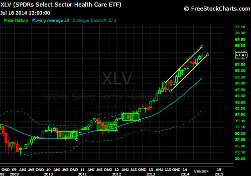 Looking at Healthcare here it appears that XLV is where Discretionary and Financials were during their last rally move. Eventually the group will become too "expensive" relative to the market and it will see rotation out, hopefully creating one of those nice buy zones like back in mid 2010 through 2012. Those bases provided the launch pad for this big surge.
While this group could continue running for an unforeseeable amount of time, the current risk/reward is out of balance when compared to the XLF or XLY in my opinion.
We use this sort of analysis to help us find strong entry points with solid risk vs reward. Once an area is identified as a potential new support zone, we watch for signals from the individual stocks that move the group. Once value has been established on the long-term timeframe we can zoom in a bit and look for profitable situations within our slightly faster weekly view.
Looking inside the XLF there are a few names that are showing some good relative value.


Within the XLY there are some nice looking value zones as well.


And here are a couple of names that are not value, that I would consider more expensive relative to most.


Do remember though, just because some of these names are relative value and others are relatively expensive doesn't mean they are automatic buys or sells respectively. The purpose of this exercise is to just get a feel for what is being relatively ignored and trading near support, and what seems to be highly in favor and trading at elevated levels from long-term support bases.
This is just another way to use multi-timeframe analysis to your advantage.
To me it looks like these groups have basically flipped positions. Now I'm getting concerned with the relative value of Tech, Energy, Healthcare, Industrials and Materials. Even Utilities have moved significantly off of their base support levels. But Financials and Consumer Discretionary seem to be of relative value at this current moment.
When running these scans I want to look for price trading mostly sideways after nearing the 20 MMA (price within 10% of MA). I prefer to see that moving average rising also. When these criteria are in place it doesn't translate directly into a buy signal, but it does mean that the stock or sector is reverting back to its trend average after correcting through time or price. Also when a group is extended from its average it doesn't mean it is an automatic sell either, it just means that price has already made its hard move off of support.
Lets take a look at a few of these to see what I mean.
You can also see that over the past 10 months the XLB has rallied strongly and is now extended beyond its base levels. I would look to be more cautious on new positions here, current holdings can continue to be held until the trend fails, but no new money should be put to work without a base support being formed.
While this group could continue running for an unforeseeable amount of time, the current risk/reward is out of balance when compared to the XLF or XLY in my opinion.
We use this sort of analysis to help us find strong entry points with solid risk vs reward. Once an area is identified as a potential new support zone, we watch for signals from the individual stocks that move the group. Once value has been established on the long-term timeframe we can zoom in a bit and look for profitable situations within our slightly faster weekly view.
Looking inside the XLF there are a few names that are showing some good relative value.
Within the XLY there are some nice looking value zones as well.
And here are a couple of names that are not value, that I would consider more expensive relative to most.
Do remember though, just because some of these names are relative value and others are relatively expensive doesn't mean they are automatic buys or sells respectively. The purpose of this exercise is to just get a feel for what is being relatively ignored and trading near support, and what seems to be highly in favor and trading at elevated levels from long-term support bases.
This is just another way to use multi-timeframe analysis to your advantage.
No comments:
Post a Comment